
Tóm Tắt Nội Dung Bài Viết
Pie Charts in IELTS Writing Task 1 are a staple of the exam, yet many students struggle to turn them into a scoring advantage. This guide from ECE goes beyond the basics, sharing in-depth analytical strategies and sophisticated language to help you confidently tackle any pie chart and achieve a high band score.
I. Overview of Pie Charts in IELTS Writing Task 1
Before diving into strategies, you need to understand the nature and types of pie charts in IELTS Writing Task 1.
1. What is a Pie Chart?
A pie chart is a circular graph used to show the proportion/percentage of different components within a whole. The defining characteristic of a pie chart is that the sum of all segments always equals 100%. Each “slice” represents a category, with its size corresponding to the proportion it occupies.
The primary purpose of a pie chart is to compare the contribution of each part to the whole or to compare this distribution across different time periods.
2. Two Main Types of Pie Charts
To approach these effectively, you need to identify the two common types:
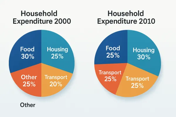
- Dynamic Pie Chart (With Timeline):
- Usually features two or more charts, each presenting data for different years, months, or time periods.
- Goal: Describe changes and trends (increase/decrease/stability) of categories over time, while comparing them at each point.
- Static Pie Chart (Without Timeline):
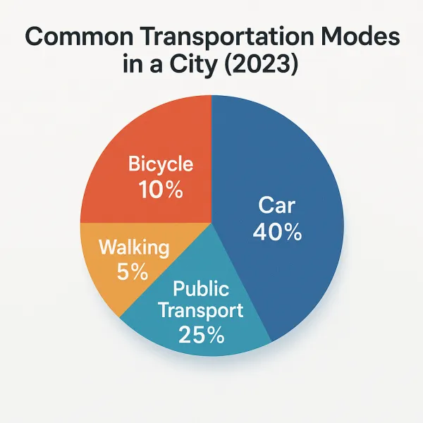
- Usually features a single chart, or multiple charts representing the same point in time.
- Goal: Compare the percentages between categories at a single point in time. Never use trend language (increase/decrease) for this type.
II. Common Mistakes When Describing Pie Charts
Pie charts may seem simple, but they are often a “trap” filled with small but critical errors. Mastering these will help you optimize your score.
1. Providing too much detail or listing data indiscriminately
- Problem: Instead of selecting “main features,” many candidates try to describe every single data point, leading to a wordy, incoherent essay that fails to highlight the big picture. This will lower your Task Achievement score.
- Solution: The goal of Task 1 is to “summarise the information by selecting and reporting the main features, and make comparisons where relevant.” Focus on:
- The largest and smallest segments.
- Segments with significant changes (if applicable).
- Segments with similar or clearly contrasting proportions.
- Grouping minor data points if they are not significant.
2. Tense confusion
- Problem: This is a basic grammatical error that candidates frequently make. Using the wrong tense (e.g., using the present tense for past data) will severely impact your Grammatical Range and Accuracy score.
- Solution:
- Underline the time frame in the prompt immediately (e.g., in 1990, between 2000 and 2010, in the present day).
- Use the past simple for past data.
- Use the present simple for current data or static data without a specific time frame.
- Future data is rare, but if it appears, use the future simple or predictive structures (e.g., is predicted to, is projected to).
3. Incorrectly paraphrasing percentages
- Problem: To diversify vocabulary, candidates often convert percentages into fractions (e.g., 50% = a half, 25% = a quarter). However, if you are unsure or misremember, incorrect paraphrasing will distort the information and cost you points.
- Solution:
- Memorize the exact percentage-to-fraction pairs and estimation adverbs (see section IV.1).
- If you are not entirely confident, write the percentage directly (e.g., 50%, 25%) rather than risking an incorrect paraphrase.
4. Failing to show relationships between slices
- Problem: Simply listing data without comparing, contrasting, or highlighting relationships between segments makes the essay a mere description rather than an analysis.
- Solution: Always look for ways to compare items:
- Compare the largest item with the smallest.
- Compare items with similar or opposing trends.
- Compare an item to the whole (e.g., accounting for more than half, making up a small fraction).
III. Strategy for Conquering Pie Charts in Writing Task 1
Follow this process to optimize your time and accuracy, from reading the prompt to finishing the essay.
Step 1: Thoroughly analyze the prompt (2 minutes)
This is the most important step that determines the direction of your essay. Underline and identify:
- Chart type: Pie chart.
- Chart format: Is there a time element (Dynamic or Static)?
- Main subject: What is the chart about (e.g., expenditure, production, population…)?
- Location/Country: Where (if applicable)?
- Units: What are they (%, $, tons…)?
- Time frame: Crucial for determining verb tenses.
- Requirement: “Summarize, select main features, compare.”
Step 2: Plan & select information for the Overview (3 minutes)
After analyzing, quickly identify 2-3 of the most striking features for your Overview. This is the “big picture” and should not contain specific data.
- For Dynamic Pie Charts (with time):
- The most prominent general trend (e.g., most items increased, only a few decreased).
- The largest/smallest segments at the beginning and end of the period (if there is a change).
- For Static Pie Charts (without time):
- The largest/smallest segments.
- The most significant differences or striking similarities between categories.
- Tip: Write the Overview before the body paragraphs to guide your essay.
Step 3: Create a detailed outline for body paragraphs (3-4 minutes)
How you group information will significantly affect the coherence and logic of your essay. Your outline should have 2 body paragraphs.
- Dynamic Pie Chart (with time):
- Option 1: Group by time:
- Body 1: Describe categories in the first year, focusing on comparing them.
- Body 2: Describe categories in the final year, focusing on comparing them AND stating the trend compared to the first year.
- Suitable when there are 2-3 charts and not too many categories.
- Option 2: Group by object/category (recommended):
- Body 1: Group categories with similar trends (e.g., all increasing, all decreasing, all stable) or those that account for large proportions. Describe their changes over the years.
- Body 2: Group the remaining categories, especially those with opposing trends or small/less important data.
- Suitable when there are many charts or categories, making it easier to compare trends.
- Option 1: Group by time:
- Static Pie Chart (without time):
- Option 1: Group by size (largest to smallest):
- Body 1: Describe the categories with the largest proportions (2-3 categories).
- Body 2: Describe the categories with smaller proportions and the rest (including “Other”).
- Suitable when there is 1 chart with many categories.
- Option 2: Group by logical categories:
- Body 1: Group categories with similarities or connections (e.g., spending on necessities vs. entertainment).
- Body 2: Group the remaining categories, potentially making a contrast.
- Suitable when there are 2 static charts comparing 2 subjects (countries, genders…).
- Option 1: Group by size (largest to smallest):
Step 4: Write the Introduction (1 minute)
Paraphrase the prompt in your own words. Ensure you include: What the chart is, what it describes, where, and when.
- Suggested structure: The pie chart(s) illustrate/show/compare/present/detail (what) in (where) over the period of (when).
Example: “The charts illustrate the proportion of different types of waste processed in a specific country in 1960 and 2011.”
Step 5: Write body paragraphs and finalize (10 – 12 minutes)
- Combine data, trends, and comparisons: Each sentence should include at least one data point and one observation (trend or comparison). Avoid just listing data.
- Use a variety of grammatical structures: Alternate between simple, compound, and complex sentences, and use passive voice to increase complexity and accuracy.
- Sophisticated descriptive language: Apply the vocabulary you have learned to express proportions, trends, and comparisons.
- Handling “Other/Miscellaneous”: Usually best mentioned at the end of body paragraphs if the data is not particularly prominent.
Step 6: Review your essay (3 – 4 minutes)
This is a crucial step to “fix points.”
- Word count: Ensure the essay is at least 150 words.
- Check tenses: Ensure they match the time frame.
- Spelling and grammar: Review for basic errors.
- Coherence & Cohesion: Use effective linking words (e.g., In contrast, However, Similarly, Meanwhile, Regarding…).
- Main Features: Ensure you have selected and reported the most prominent features as required.
IV. Advanced Vocabulary and Structures for Describing Pie Charts
Using language flexibly and accurately is the key to achieving a high band score.
1. Vocabulary for expressing percentages
In IELTS, besides writing the percentage (%) directly, you can use these phrases to diversify:
2. Verbs & phrases for describing proportions
- X accounts for/makes up/constitutes/comprises/represents Y% of Z.
- Example: “Agriculture accounts for 25% of the total budget.”
- Note: “comprise” and “constitute” do not take “of”.
- The proportion/percentage of X is Y% / stands at Y%.
- Example: “The proportion of plastic waste is 15%.”
- X is the largest/smallest segment, at Y%.
- Example: “Education is the largest segment, accounting for 30%.”
- X is followed by Y at Z%.
- Example: “Healthcare is followed by transport at 10%.”
- X makes up the majority/minority of Z.
- Example: “The service sector makes up the majority of the workforce.”
3. Vocabulary for describing trends (for Dynamic Pie Charts)
When there is a time element, you need to use trend-describing vocabulary.
- Increase: increase, rise, grow, go up, climb, rocket, soar
- Decrease: decrease, decline, fall, drop, go down, plummet, dip
- Stable: remain stable/constant/unchanged, level off, stay the same
- Fluctuate: fluctuate, vary
Combine with adverbs/adjectives describing degree: sharply, significantly, considerably, dramatically, slightly, gradually, steadily, marginally, consistently.
- Example: “The proportion of renewable energy increased significantly from 10% to 25%.”
- Example: “Housing expenditure fell sharply from 30% to 15%.”
4. Expressions for comparing and contrasting
- Example: “Healthcare spending in Country A is similar to that in Country B, at 15% and 14% respectively.”
- Example: “Household spending on food decreased, whereas spending on entertainment increased significantly.”
- Example: “Transport accounts for a larger proportion in urban areas, in contrast to rural areas where the proportion is very small.”
V. Advanced Tips and Time Management
Apply these tips to improve your efficiency in the exam room.
- Make the most of 40 minutes:
- Analyze prompt & Outline: 5-7 minutes
- Write Introduction & Overview: 3-4 minutes
- Write Body Paragraphs: 10-12 minutes (5-6 minutes per paragraph)
- Review: 3-4 minutes
- Avoid writing a conclusion: IELTS Writing Task 1 does not require a conclusion. Do not waste time summarizing what you have already said.
- No personal opinion: Only describe and compare the provided data. Never speculate or provide reasons for the trends.
- “Do’s and Don’ts” Quick List:
- DO: Write an Overview without data. Select main features. Compare continuously. Use varied vocabulary and structures. Check tenses and grammar carefully.
- DON’T: List data indiscriminately. Add personal opinions. Write a conclusion. Use incorrect tenses. Copy the prompt.
Hopefully, with these in-depth strategies and tips from ECE, you are fully equipped to conquer Pie Charts in IELTS Writing Task 1. Mastering data analysis and flexible language use will help you confidently describe any pie chart, thereby improving your IELTS Writing band score. Turn theory into action by practicing regularly!





 Khai giảng Khóa học Hè cực HOT.
Chưa có bình luận nào!