


Tóm Tắt Nội Dung Bài Viết
In IELTS Writing Task 1, candidates frequently encounter Bar Charts. This task requires the writer to accurately describe, analyze, and compare data. This guide from ECE provides a comprehensive look at Bar Charts, common types, and a step-by-step strategy to effectively tackle the exam and achieve a high band score.
What is a Bar Chart and Why is it Important in IELTS Writing Task 1?
A Bar Chart uses bars (either vertical or horizontal) to present and compare data categories or show changes over time. Each bar represents a specific category or time period, and the height (or length) of the bar represents the corresponding numerical value.
Mastering how to analyze and write about Bar Charts is essential because this task evaluates the following candidate skills:
- Objective Description: The writer must present information from the chart without adding any personal opinions.
- Data Analysis and Selection: Candidates need to identify key features, main trends, and the most important points of comparison.
- Comparison and Contrast: The writer must clarify the relationships between figures rather than simply listing individual numbers.
- Use of Precise Language: Candidates must apply a diverse and accurate range of vocabulary and grammar to describe data and trends.
- Coherent Organization: The writer needs to construct a report with a clear layout that makes it easy for the reader to follow the information.
Types of Bar Charts and Approach Strategies
While there are many ways to classify Bar Charts, the most effective way to approach them in IELTS Writing Task 1 is based on the time factor:
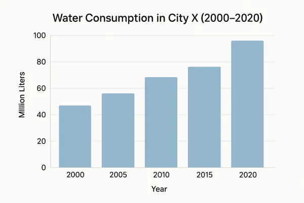
1. Time-based Bar Charts
- Characteristics: These charts display data across multiple time points (e.g., the years 1990, 2000, 2010). Each bar or group of bars represents a specific year.
- Key Strategy: This type is approached similarly to a Line Graph. You should focus on describing the trends of the subjects over time (increase, decrease, stability, fluctuation), the peaks/lows, and the most notable changes. Comparing trends between subjects is also crucial.
- Example: A Bar Chart showing the water consumption of a city from 2000 to 2020.
2. Comparison Bar Charts (No Time Factor)
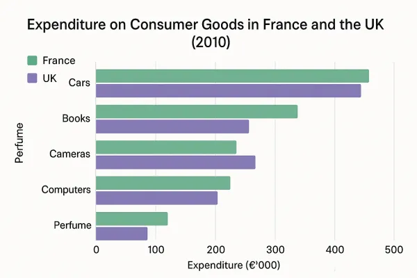
- Characteristics: These charts display data at a fixed point in time or compare different categories without a specific focus on time (e.g., spending by different countries on various items in the same year).
- Key Strategy: This type focuses entirely on comparing and contrasting figures between categories. You need to identify the highest/lowest values, significant similarities/differences, and group related information for description.
- Example: A Bar Chart comparing consumer spending in France and the UK across five categories (Cars, Books, Cameras, Computers, Perfume) in 2010.
4 Steps to Writing an Effective Bar Chart Report
To write a high-scoring Bar Chart Task 1 report, you should follow a systematic 4-step process:
Step 1: Analyze the Prompt and the Chart (Approx. 5 minutes)
This is the most critical step to ensure you understand the requirements and set the direction for your writing. Answer the following questions:
- What: What does the chart describe? (The main subject or topic).
- Where: Where is the information from? (The location, country, or region mentioned).
- When: What is the time frame? (A specific year or a period).
- Unit of measurement: What is the unit for the data? (e.g., percentage (%), quantity (millions, thousands), currency ($), degrees Celsius, etc.).
Additionally, immediately determine if this is a time-based or comparison-based Bar Chart to shape your writing strategy.
Step 2: Select Key Features and Outline (Approx. 5 – 7 minutes)
Candidates should not—and are not expected to—describe every single number in the chart. Instead, focus on the “main features” as requested by the prompt.
- Identify the most prominent points:
- The highest point (peak) and lowest point.
- The most significant change or areas that remained stable.
- Overall trends (if the chart is time-based).
- Significant similarities or differences between categories.
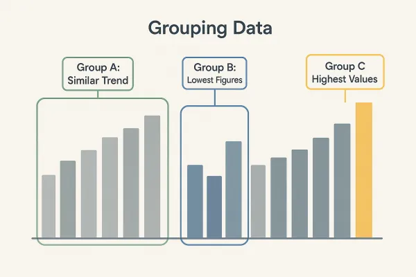
- Grouping Data: This is a core technique to avoid simple listing and to increase the coherence of your report.
- By similar trends/values: Group subjects that show similar increases/decreases or have approximate values.
- By subject/category: Focus on describing one or two main subjects/categories in one paragraph.
- By time (if applicable): You can divide body paragraphs based on specific time points or periods.
- Create a Detailed Outline:
- Introduction: Paraphrase the prompt.
- Overview: State 2-3 of the most prominent overall features/trends (NOTE: Do NOT include specific data here).
- Body Paragraph 1: Describe the first group of key features in detail, including data and comparisons.
- Body Paragraph 2: Describe the second group of key features in detail, including data and comparisons.
Step 3: Writing (Approx. 25 minutes)
Apply your outline and use appropriate language.
Introduction
- Goal: Briefly introduce the chart by paraphrasing the prompt using synonyms and changing the sentence structure.
- Suggested Structure:
The bar chart + show(s)/illustrate(s)/present(s)/compare(s) + [main subject] + [location] + [time]. - Paraphrasing Example:
- Prompt:
The bar chart below shows the percentage of government spending on roads and transport in 4 countries in the years 1990, 1995, 2000, 2005. - Paraphrase 1:
The given bar chart illustrates how much four different countries invested in roads and transport between 1990 and 2005. - Paraphrase 2:
The provided bar graph compares the proportion of governmental expenditure on road infrastructure and transportation across four nations over a 15-year period from 1990.
- Prompt:
Overview

- Goal: Summarize the most prominent overall trends or features without going into specific data. This is the most important paragraph for achieving a high band score in Task Achievement.
- Important Notes:
- NEVER include specific numbers in this section.
- Select only 2-3 main, general points.
- Use phrases like:
Overall,In general,It is clear from the chart that,A glance at the graph reveals that.
- Strategy for Each Type:
- Time-based Bar Chart: Focus on the overall trend (increase/decrease/stability) of the main categories or the clear difference between the start and end points.
- Example:
Overall, while the consumption of fresh fruit generally increased over the period, vegetables saw a fluctuating trend. Notably, males consistently consumed less than females across all years.
- Example:
- Comparison Bar Chart: Focus on the category with the highest/lowest value or groups of categories with significant differences/similarities.
- Example:
Overall, it is apparent that car expenditure accounted for the largest proportion in both countries, whereas spending on perfume was consistently the lowest. Furthermore, both nations allocated a larger budget towards purchasing cars as compared to other merchandise.
- Example:
- Time-based Bar Chart: Focus on the overall trend (increase/decrease/stability) of the main categories or the clear difference between the start and end points.
Body Paragraphs
- Goal: Provide detailed information, specific data, and relevant comparisons. This is where you demonstrate your ability to use a variety of vocabulary and grammar.
- Important:
- Always compare; NEVER just list: Use comparative and contrastive structures (e.g.,
in contrast to,compared with,whereas,while,significantly higher/lower than,roughly the same as). - Use approximation language: When data isn’t exact, use words like
approximately,around,just over/under,nearly,almost. - Cohesion & Coherence: Use linking words (e.g.,
Furthermore,Moreover,In addition,However,By contrast,Similarly) to create flow between sentences and paragraphs.
- Always compare; NEVER just list: Use comparative and contrastive structures (e.g.,
- Strategy for Each Type:
- Time-based Bar Chart:
- You can divide paragraphs by subject: Describe the trends of one or two subjects in Body Paragraph 1, and the remaining subjects in Body Paragraph 2.
- You can also divide by time: Describe the main figures/trends in the first period in Body Paragraph 1, and the latter period in Body Paragraph 2.
- Example Structure:
[Topic 1] began at X% in [year 1] and then [trend verb] to Y% in [year 2]. In comparison, [Topic 2] followed a similar/different trend, [description].
- Comparison Bar Chart:
- Group by value: Body Paragraph 1 can describe the highest/lowest categories or similarities. Body Paragraph 2 describes the remaining categories or differences.
- Group by subject/category: If there are multiple groups (e.g., spending by men and women), you can describe male spending across categories in Body Paragraph 1 and female spending in Body Paragraph 2, incorporating direct comparisons.
- Example Structure:
Regarding [Category A], [Item X] recorded the highest figure at Z%, which was significantly higher than [Item Y] at W%. In contrast, [Category B] showed a different pattern, with...
- Time-based Bar Chart:
Step 4: Review and Proofread (Approx. 2 – 3 minutes)
Before submitting, take time to:
- Check spelling and grammar: Ensure absolute accuracy.
- Word count: Ensure you have written at least 150 words.
- Check Task Achievement: Have you answered all parts of the prompt? Is the Overview clear? Have you made sufficient comparisons?
- Check Cohesion & Coherence: Are the ideas logical and connected with appropriate linking words?
Lexical Resource & Grammatical Range in Bar Chart Tasks
To score high, you must diversify your vocabulary and grammatical structures.
1. Verbs & Nouns for Describing Trends (For Time-based Bar Charts)
- Upward Trends:
rose,increased,grew,climbed,went up,surged,rocketed(verbs) /a rise,an increase,a growth,a surge(nouns). - Downward Trends:
fell,decreased,declined,dropped,plunged,slumped(verbs) /a fall,a decrease,a decline,a drop,a slump(nouns). - Stable Trends:
remained stable/steady/unchanged,levelled off,stabilized(verbs) /stability(noun). - Fluctuating Trends:
fluctuated(verb) /a fluctuation,volatility(noun). - Peaks/Lows:
reached a peak of,hit the highest point,bottomed out,hit a trough/the lowest point(verb phrases).
2. Adverbs & Adjectives for Speed/Degree of Change
- Strong/Significant:
dramatically,sharply,significantly,substantially,considerably,steeply(adverbs) /dramatic,sharp,significant,substantial,considerable,steep(adjectives). - Gradual/Slight:
gradually,moderately,slightly,marginally(adverbs) /gradual,moderate,slight,marginal(adjectives).
3. Comparison & Contrast Language (For both types)
- Comparative phrases:
compared to/with,in contrast to/with,whereas,while,on the other hand. - Comparative structures:
significantly higher/lower than,twice as many/much as,three times the figure for,roughly similar to,almost the same as. - Verbs showing superiority:
outnumbered,exceeded,surpassed,trailed behind.
4. Using Prepositions with Data
at: Used for a specific figure (e.g.,at 20%,at its peak of 50 units).to: Used to show a change to a certain level (e.g.,rose to 30%,fell to 15%).by: Used to show the amount of change (e.g.,increased by 10%,decreased by 50 units).of: Used to express a difference (e.g.,a difference of 10%).from... to...: Used for a time period or data range (e.g.,from 1995 to 2002,from 10% to 30%).
5. Using Complex Sentences Appropriately
Use complex structures like relative clauses (who, which, that), adverbial clauses (while, whereas, although, despite, in spite of), and passive voice to enrich your grammar.
- Example:
While expenditure on cars was the highest in both countries, reaching approximately £450,000 in the UK, spending on perfume remained notably low.(Useswhilefor comparison). - Example:
The number of students enrolled in online courses witnessed a dramatic surge, rising from 10,000 in 2005 to 50,000 in 2015, which represented a five-fold increase over the decade.(Uses a relative clausewhich representedand describes growth in detail).
Common Mistakes and How to Avoid Them
To avoid losing unnecessary points, here are common pitfalls when writing about Bar Charts:
- Listing data instead of comparing/analyzing:
Fix: Always ask yourself: “How does this data compare to the others? Are there notable similarities or differences?” Then, use the comparative structures and grouping techniques mentioned above.
- No clear Overview or including specific data in the Overview:
Fix: Write a separate Overview focusing only on 2-3 main features, and never use specific numbers in this section.
- Confusing Bar Chart types and using the wrong vocabulary/strategy:
Fix: Identify the chart type in the first step to apply the right strategy (focus on trends for time-based, focus on comparison for non-time-based).
- Inaccurate data or incorrect estimation:
Fix: Read the figures very carefully. If you aren’t sure of the exact number, use approximation language (e.g., approximately, roughly, just over/under, nearly, almost).
- Lack of coherence and linking between ideas:
Fix: Use a variety of linking words/phrases like Furthermore, In contrast, However, Similarly to connect sentences and paragraphs, making the report flow naturally.
Conclusion
Mastering Bar Charts in IELTS Writing Task 1 requires a combination of chart literacy, smart data analysis, and the flexible use of academic language. By applying the steps and strategies presented here—focusing on comparison, grouping data, and avoiding simple listing—you will be able to write a coherent, clear report that earns a high score.
Explore more guides for IELTS Writing Task 1:
How to write Table tasks in IELTS Writing Task 1
Strategies for IELTS Writing Task 1 Process/Diagram





 Khai giảng Khóa học Hè cực HOT.
No comments yet!