


Tóm Tắt Nội Dung Bài Viết
One of the first task types you’ll encounter when starting IELTS Writing Task 1 is the “line graph” or “line chart.” Many candidates breathe a sigh of relief when they see this type—are you one of them? If so, that’s fantastic; this post will serve as a great refresher to help you solidify your knowledge. If not, don’t worry at all—let’s dive in and master it together with ECE.
A. Overview of the Line Graph in IELTS Writing Task 1
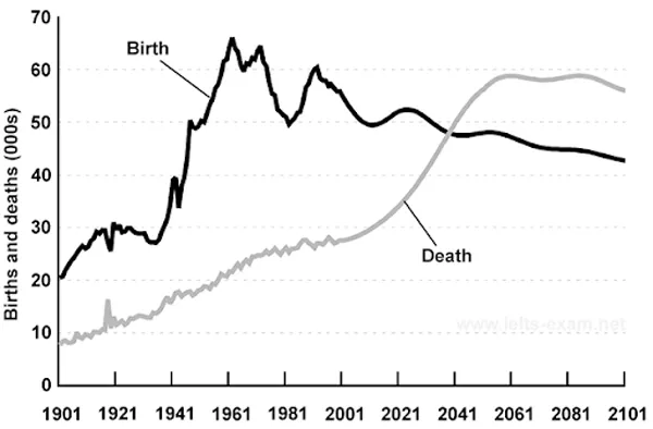
Line graphs are used to illustrate how information or data changes over time. A graph consists of an x-axis (horizontal) and a y-axis (vertical). Typically, the x-axis represents a time period, while the y-axis represents the quantity being measured. Line graphs are ideal for showing data with peaks (increases) and troughs (decreases). In other words, they are perfect for highlighting trends.
B. Candidate Requirements
You need to analyze the prompt thoroughly and write an objective report based on the information provided in the graph. Your response should be at least 150 words and completed within 20 minutes.
Focus on describing the trends for each subject using appropriate, accurate, and varied language and structures. When writing, be selective with your data; avoid listing every single figure from the graph to ensure your response is concise, coherent, and—most importantly—completed within the allotted time.
C. Basic Structure
The standard structure for an IELTS Writing Task 1 line graph response consists of three main parts:
1. Introduction
- Purpose: Introduce the topic of the graph.
- How to write: Paraphrase the prompt using your own words.
2. Overview
- Purpose: State the main trends and key features without citing specific data.
How to write:
- Provide a general comment on increases/decreases and the highest/lowest points.
- Compare clear differences between the subjects.
3. Details/Body Paragraphs
- Purpose: Analyze the data in detail by grouping it logically.
- How to write:
- Divide the data into two logical groups (e.g., by time period or trend).
- Compare and detail each trend using specific figures.
- Use trend-related vocabulary (e.g., increase, decrease, fluctuate, remain stable, peak at, etc.).
💡 Important Notes:
✅ Use the appropriate tense based on the time frame of the graph.
✅ Do not include personal opinions or explain the reasons behind the trends.
✅ Use varied vocabulary and sentence structures to boost your Lexical Resource and Grammar scores.
✅ Unlike Task 2, you can omit a formal Conclusion, as the Overview already provides a clear summary.
D. Analyzing the Graph
One of the biggest mistakes candidates make is rushing into writing as soon as they see the prompt, skipping the analysis phase. You might think this saves time, but the reality is quite the opposite. It actually takes longer, and more importantly, the writing will lack focus. Think of it like setting off on a journey without a destination or a map. Instead of wandering aimlessly, why not take a few minutes to plan your route before you start?
The question is: what exactly should you analyze, and how? Let’s look at the example below.
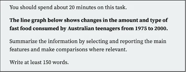
Now, help me answer the following questions:
- What is the topic of this graph?
- Which subjects are mentioned?
- What is the unit of measurement?
- What is the time period covered?
- What location is mentioned?
Now, let’s check the answers with ECE!
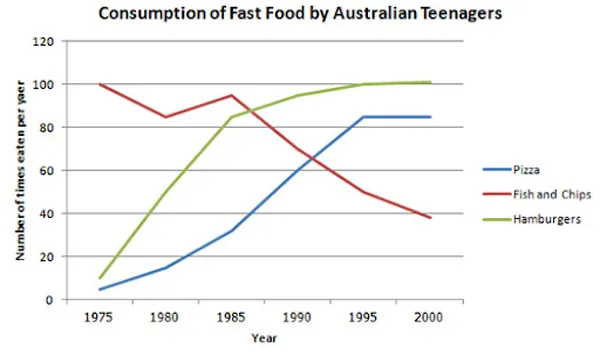
The graph shows changes in the fast food consumption of Australian teenagers from 1975 to 2000, covering three main food items: Pizza, Fish and Chips, and Hamburgers. The unit of measurement is the number of times these foods were consumed per year.
Next, a tougher question: If you were an employee reporting to your boss, how would you summarize the most general and concise points of this graph? Here are a few tips:
- General trends: Which lines increase, decrease, fluctuate, or remain stable over the period?
- Key features: Look for superlatives—which line increased or decreased the most? Which had the highest or lowest figures?
Do you have your answers ready? Let’s take a look.
- Chicken consumption showed an upward trend, while the opposite was true for beef, lamb, and fish.
- While chicken and beef fluctuated significantly, lamb and fish showed more moderate changes.
- Fish was the least popular protein throughout the entire period.
- Chicken overtook beef to become the most consumed protein in the second half of the period.
Now that the preparation is done, are you ready to try writing it? Set a 20-minute timer and let’s get to work.
“The line graph provides information about the annual consumption of fast food among Australian youngsters, specifically the intake of pizza, fish & chips, and hamburgers from 1975 to 2000.
Overall, the consumption of fish and chips showed a significant decline over the years, whereas a steady increase can be seen in the intake of pizza and hamburgers. In addition, hamburgers emerged as the most popular choice during the latter half of the period.
In 1975, the numbers of fish and chips consumed stood at approximately 100 times per year, making them the most popular fast food item at the time. Despite some fluctuations over the next decade, they retained their top position until 1987. However, after this point, consumption steadily declined, reaching around 40 times per year by 2000.
Conversely, the consumption of pizza and hamburgers started at much lower levels in 1975, with figures of approximately 5 and 10 times per year, respectively. Over time, both saw significant increases, with hamburgers experiencing the most substantial growth. By 2000, the yearly intake of hamburgers had surged nearly tenfold. Pizza consumption also rose consistently until 1995, after which it plateaued, aligning closely with the intake of hamburgers for the remainder of the period.”
In summary, the line graph is one of the most common and important task types in IELTS Writing Task 1. To achieve a high score, candidates must master data analysis, identify key trends, and present information in a coherent, logical manner. Additionally, using trend-describing vocabulary flexibly and diversely will help elevate the quality of your writing.
I hope this post has helped you reinforce your knowledge of this graph type and feel more confident when tackling it. See you in the next post, where we will dive deeper into how to write this task type. Good luck!
See more here:
How to write IELTS Writing Task 1 Process/Diagram
How to write IELTS Writing Task 1 Bar Chart





 Khai giảng Khóa học Hè cực HOT.
No comments yet!